I wanted to use this post blog to develop and evolve a P-Diagram that performs better during early design stages of a design, regardless of the field.
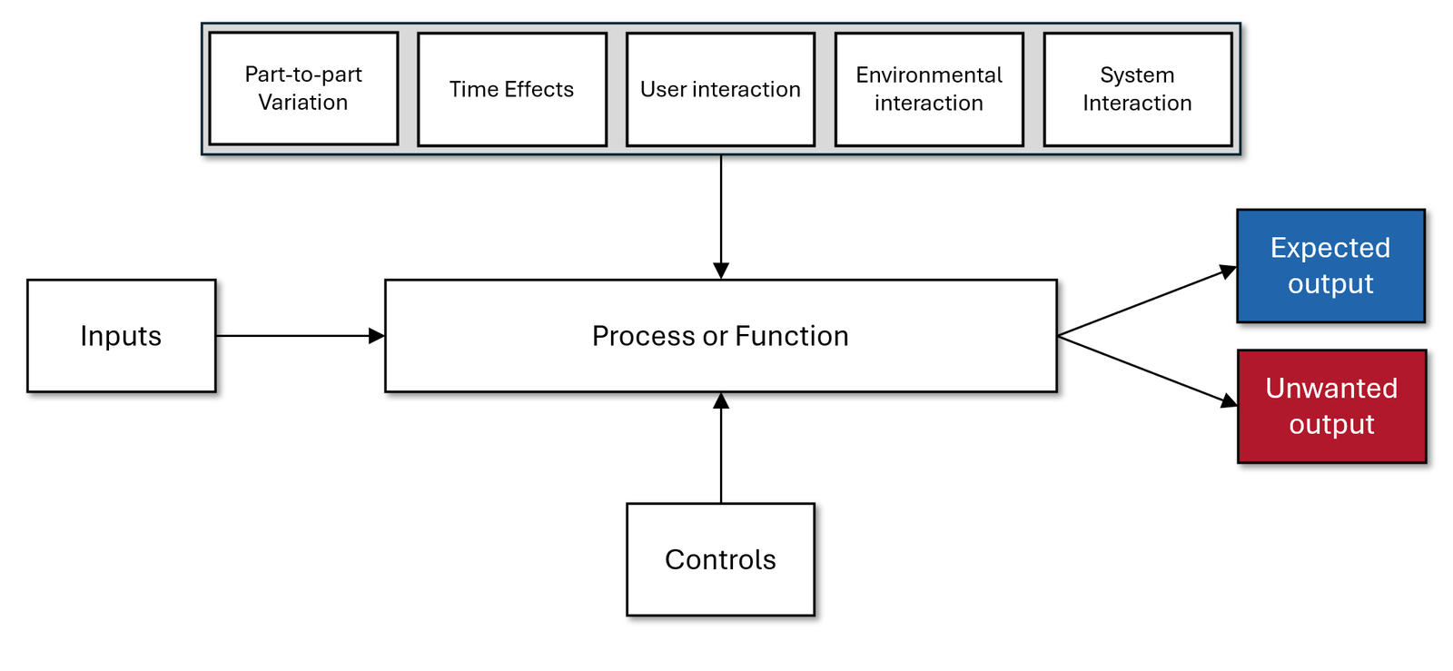
Let’s define the scope first. When we talk about a P-Diagram—whether we are business developers, engineers, librarians, cooks, or anything else—we usually envision something like this:

Let’s now imagine that we are cooks preparing a Spanish potato omelet, known as tortilla de patatas.
To make one, you’ll need eggs, potatoes, optional onions, and cooking oil of medium to high quality and of course, salt. These ingredients represent the inputs in our diagram.
The controls are the tools and methods you use to make the tortilla de patatas. Ideally, you’d have a frying pan, preferably large, a second pan for the onions if you decided to include them, and a stove.
Above the Process or Function main box, you’ll find the Disturbances: things that work against your goal of crafting a perfect omelet and could even lead to a complete disaster—an inedible mess!
Finally, the Expected Output is the omelet itself. The Unexpected Output, on the other hand, includes anything you didn’t intend to produce, like a broken pan, spilled oil, burnt fingers, or the smoke alarm going off because of excessive smoke. In summary, anything you didn’t want to happen.
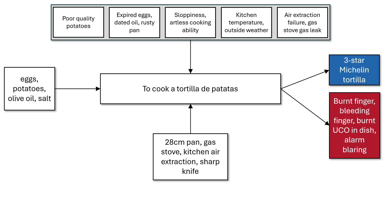
With this in mind – and with some imagination about what could disrupt our peaceful morning of cooking – we now have:

Now it’s much easier to describe real-life situations. Let’s go over four examples:
- You might be a novice cook, and using a large knife to chop potatoes could lead to a minor cut on your finger.
- You could use low-quality potatoes or expired eggs, which wouldn’t result in a 3-star tortilla, but rather something that sends you to the bathroom every two hours for the next two days.
- You might forget to turn on the ventilation, causing enough smoke for the alarm to go off as though your house were on fire.
- You could get an omelet plus some UCO (unidentified cooked object) next to it.
The engineering point of view
We use a P-Diagram to define the events and actions for almost any process we can imagine. It helps us in defining events like the real-life situations of the omelet example.
The problem is that traditional P-Diagrams focus heavily on disturbances and environmental factors, which is great for manufacturing but less useful in the design phase. Designers need a way to focus more on controls that directly impact functionality during the conceptual stages.
Engineers need a tool to assess risks affecting the product’s performance and functionality, independent of the future manufacturing process.
When FMEA became commonplace during design stages too, the so-called d-FMEA (the d is for design) came into the scene too, and the P-Diagram came along with it as it was used then. This was not that bad: the designers also wanted to contribute to an improved manufacturing process.
But we don’t want to discuss that today. Instead, we are asking: what if we had a fast, but accurate and useful way to tell, during a dFMEA or during any design activity in general, what risks are affecting the performance of the product itself?
The P-Diagram and their interactions are well understood. However, the issue is that they do not address design problems; instead, they assist manufacturing in resolving its issues. While this is acceptable, it is not our focus today.
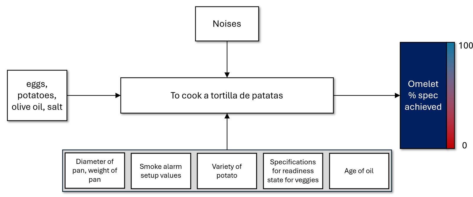
I propose a modification to the P-Diagram that will render it hugely beneficial during the design phases. It will become a valuable tool for designers to pinpoint aspects within their designs that can be altered to enhance the design itself, regardless of the future manufacturing processes. Let us for now see how the omelet P-Diagram looks like when we move from detailing noises to detailing controls:

This is how a P-Diagram for design stages might look like. Now we simply see Noises, like that, without further detailing, but now we can see the expansion of the Controls.
I did not try any classification in the controls, just showed things that affect the functionality and performance, not the additional outputs that are unwanted. Here we care only about the performance of the output omelet, as we see in the only output “Omelet %spec achieved”, along with a graded bar.
Let’s now evaluate some findings:
- You may pick the wrong potato variety, say some with too much starch or not enough flavor. This will affect the final omelet very clearly.
- It could be the case that we cook with a quite re-used oil, with particles or dust or too much previous flavor in it. This is going to affect the flavor of the final omelet.
- We could get the wrong specifications to start with, maybe because we got the recipe from a person who never produced a decent omelet.
All of these and more factors would influence the final omelet, and we could move the rate from the ideal 100%, a perfect, 3 Michelin star omelet, down to a mediocre one, like in the 50% or less.
What I wanted to show you here is that in the original P-Diagram we found out what could be potentially delivering unwanted results along with the omelet, whereas in the second one, we can see which factors affect just the performance of the desired output.
I did not include other complexities or factors affecting other factors; just wanted to show you that you can use both diagrams as you see them fit, and get much more information or tailor the diagram to the stage of development you need at a given time.

Leave a Reply